
The same prompt, pasted as-is into two apps with opposite designs — a pastry shop all cream and pink, a radio station in near-black and amber. Not one instruction about looks: no color, no font, no corner radius. Both sections came out dressed like they were born there. Here is what generation read without being told.
Prompt teardown, episode 4. The series where we take AI Extension Builder prompts apart to read what they really trigger: what each sentence gets, the choices generation makes without being told, what the section can do once it is in place. Today: one single prompt, pasted twice into two fictional demo apps — and a question it was never asked: what should the section look like?
A prompt that says nothing about style
The section we asked for is called "Today & tomorrow": the schedule for the next two days, read from the app's agenda, with a tab to switch between them; visitors pin what they don't want to miss, and the app remembers that shortlist from one visit to the next. The prompt — it is at the end of this article — describes that behavior, and nothing else. Read it again: there is not a single word about appearance.
We pasted it into two apps built to face away from each other. "Pastries' House", a fictional pastry shop: cream background, a typeface all in curves, candy pink and chocolate. "Radio Alba", a fictional local radio station: near-black screen, white titles, amber and red. If generation had only the prompt to work with, the two sections should come out identical.
In the pastry shop

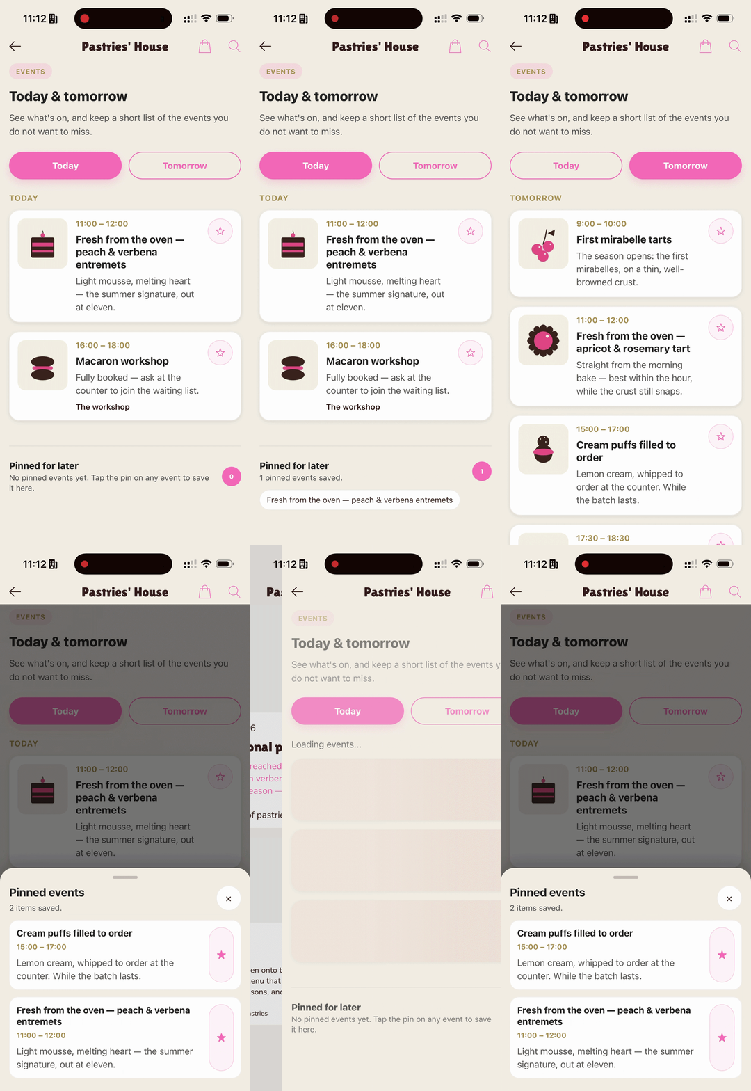
In "Pastries' House", the section arrives in cream: white cards sitting on the app's background, gold-toned times, pins and tabs in candy pink — two rounded pills, "Today" and "Tomorrow", that echo the grammar of the navigation bar. The events on screen are the real ones: the bakes and workshops entered in the app's agenda, thumbnails included. The pinned selection settles at the bottom, in a "Pinned for later" tray — and since it belongs to the visitor alone, it lives on their phone, back at every visit, with no account and no questions asked.
In the radio app

In "Radio Alba", same prompt, another temperament. The section comes out dark: charcoal cards, dates and times in amber, the active tab in red — the radio station's accents, not the pastry shop's. And it is not the same section repainted: the layout changes too. The time aligns to the right of the card, the two tabs sit in a compact switcher, the whole card responds to a tap to pin. Down to the subtitle, written by generation and different from one app to the other: "What's happening now and next" here, "See what's on, and keep a short list…" over there.
Two apps, two outfits, two interpretations — and still zero style instructions in the prompt.
What generation read
The prompt you write is not the only text generation receives. With every request, the platform attaches your app's visual identity sheet: its palette, role by role — the background, the surfaces, the color of actions, the color of titles, the separators — with one simple instruction: the section should look like it was born in this app. That is why candy pink lands on the pastry shop's pins and red on the radio station's active tab: each one read its own sheet.
In the article introducing the AI Extension Builder, Jerome said it in one sentence: the app's overall style — colors, spacing, contrasts — follows automatically. The invisible part of the prompt is exactly that. And it does not stop at style: when your description names one of the app's sections — here, "Events" — generation also receives what it needs to read it. That is why the schedule on screen is the real one, thumbnails included.
And if you had to maintain the code yourself? That work has a name: a brand guide to transcribe into variables, every component to go through, and everything to go through again at the first rebrand. Here, it is redone at every generation — without taking up a single line of your prompt. Paste the same prompt into a third app tomorrow: it is that app's own sheet generation will read.
What doesn't change

Not everything follows the app's design, and that is deliberate. The pastry shop's signature typeface — those plump, rounded titles — stays on the native screens; generated sections write in the system font, the native register of each phone, readable everywhere. Same for the foundation: comfortable touch targets, sufficient contrast, loading states and empty screens planned from the start. That part is not negotiated in the prompt — it protects the section, and your users, whatever the app.
The most telling picture is two screens of the same app side by side: the pastry shop's native agenda — pink banners, house typeface — and the generated section. Same content, same thumbnails, two typographic registers — and one single house.
The full prompt
Here it is, exactly as pasted, twice, without one line more:
Between the two results, not one character of the prompt changed. Only the app changed — and the app did all the styling.
Your turn
Take this prompt, replace "Events" with the name of a section in your app, and paste it: the section will come out at home, in your colors. Then try the opposite exercise: ask for a deliberate departure — a pin button impossible to miss, a block that clashes with the rest — and watch what moves, and what holds. It is the best way to feel where your prompt ends and where what the platform reads on its own begins.
The first episode of the series took apart a section that remembers a parking spot and reaches for the phone's GPS and Maps: Prompt teardown: GPS, memory, and Maps from a single sentence. And the summer quiz from the sister series already showed the same reflex: generated inside an app, dressed by it.
The AI Extension Builder is in beta, open to everyone: create an app with GoodBarber and describe your first section.
FAQ
Do I need to describe my app's design in the prompt?
No. The app's palette is read at every generation, without you having to restate it: describe the behavior, the style follows. If you want to steer the look — a mood, a detail that matters to you — say it like everything else: your description remains the specification.
What happens to the section if I redesign my app later?
A section's styling is set at the moment it is generated. After a redesign, simply ask for an iteration — "match the section to the new design" — and generation rereads the app's sheet, now up to date.
Can I ask for a section that clashes with the rest of the app?
Yes. The departure you want is described like any other requirement: a promotional block that has to contrast, a button that has to dominate the screen. Generation always starts from the app's identity — your sentence defines the departure, and the readability foundation stays in place.
Why doesn't the section use my title font?
Generated sections write in the phone's system font: the register of native interfaces, readable and consistent on iOS and Android alike. Your signature typeface remains that of your native screens — the two live side by side in the same app, each in its place.